Numbrs Home
2019 — Numbrs AG
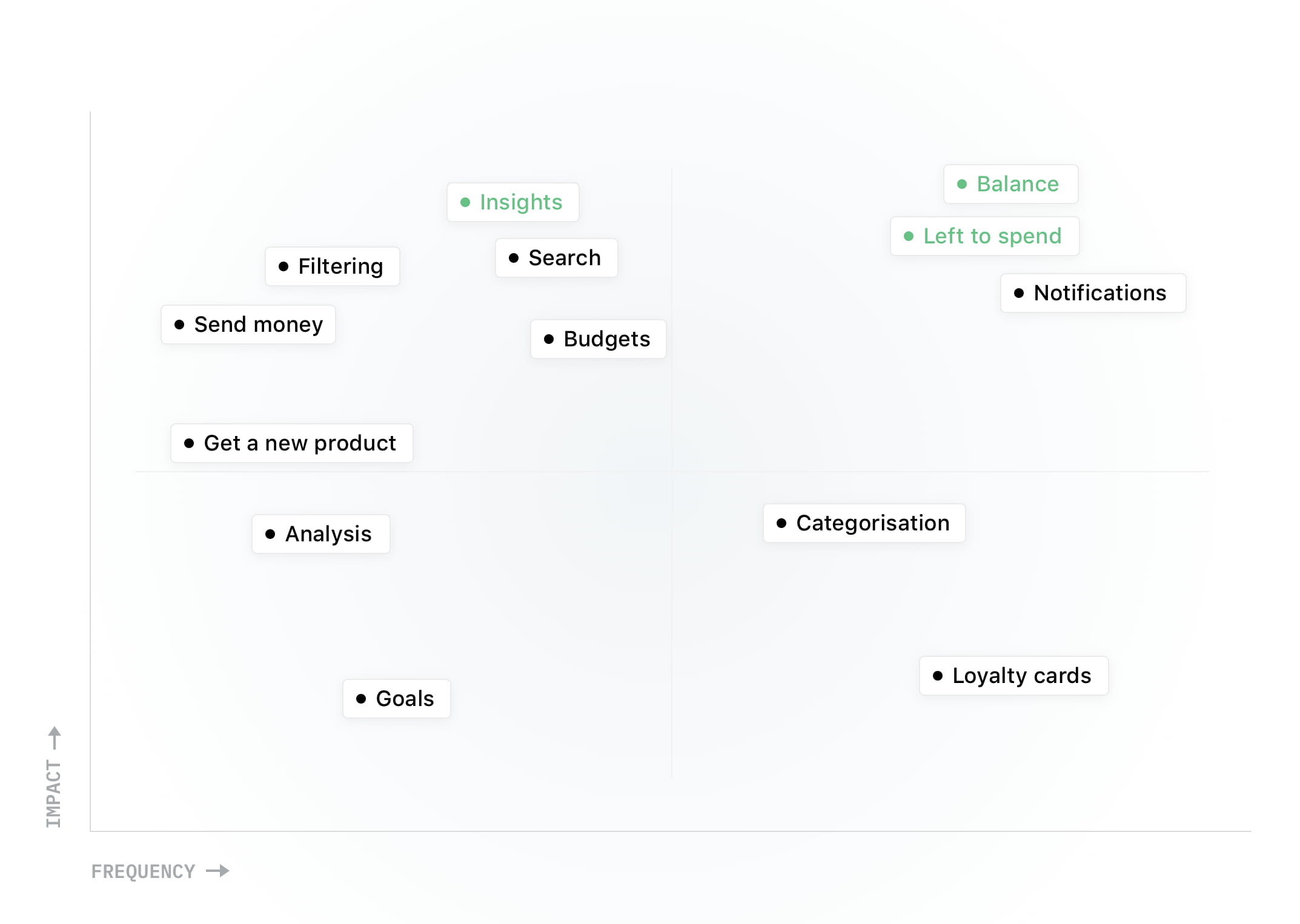
Over the years, I have designed several concepts to simplify Numbrs, our mobile bank app, to focus on what really matters in daily finances. Research told me that our users mostly employed Numbrs to do a few critical jobs. Bringing these into focus was also in alignment with our business goals.
This realisation led to perhaps the most impactful change we have made in Numbrs, redesigning the timeline and developing some fine features to support it.
Due to my NDA, I can only share selected details of the project—no research, strategy or business background.
Getting started
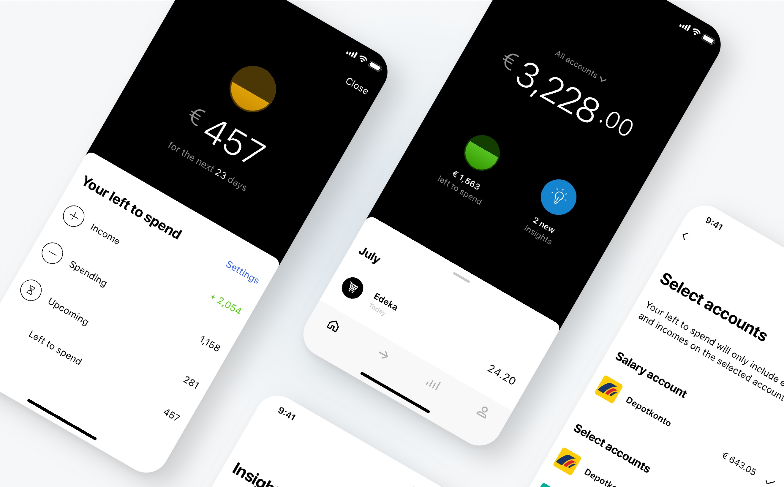
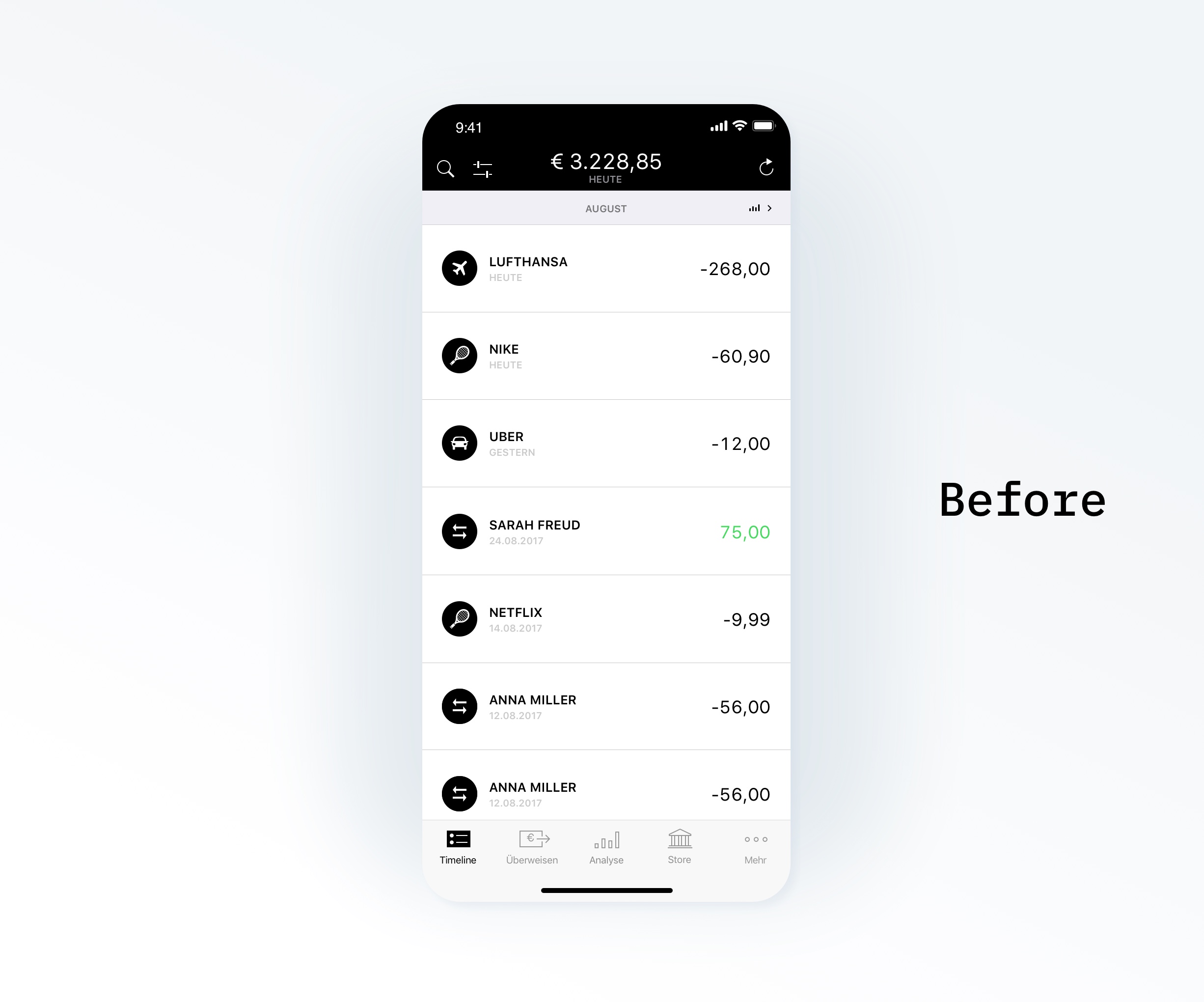
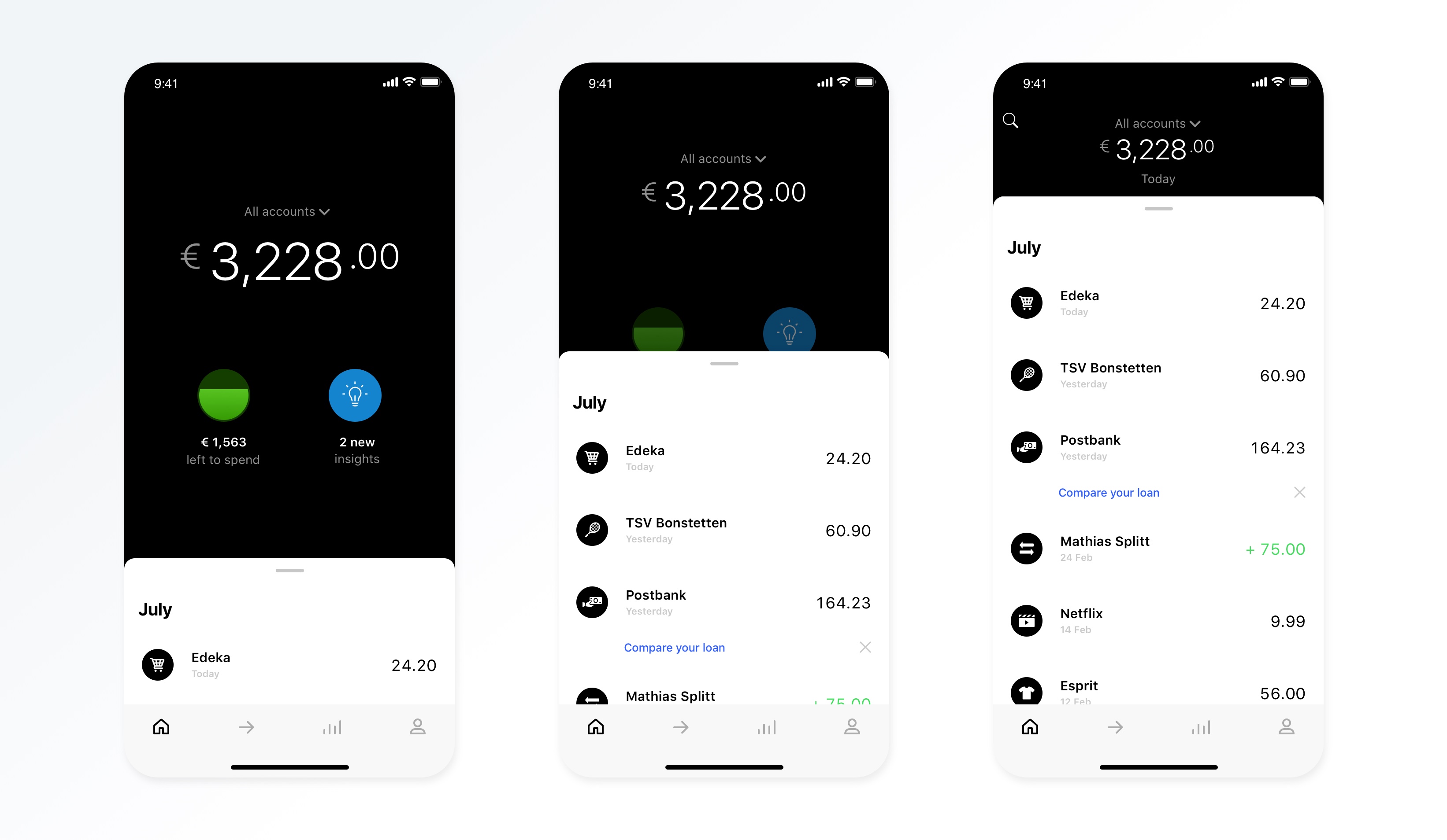
The desirable subject of this redesign, the timeline, was single-handedly the most-used feature of our app. The original design followed the canonical banking app layout showing your balance and transactions.
Based on our quantitative and qualitative research and in consultation with our business and AI teams—and painfully aware of the 9x effect—, I came up with a concept for a new home screen that answers our users’ three main questions:
- What’s my overall balance?
- How much can I safely spend?
- Can I do something to improve my finances?
Design principles
To guide my design process, I laid down the following principles:
- Reduce thoughtfully
- Provide continuity: users should immediately see where their timeline now resides
- Zero set-up: features for all users should work out of the box
- Explain how the machine thinks: users should be able understand how we got to the results they see (ie. sources and algorithms)
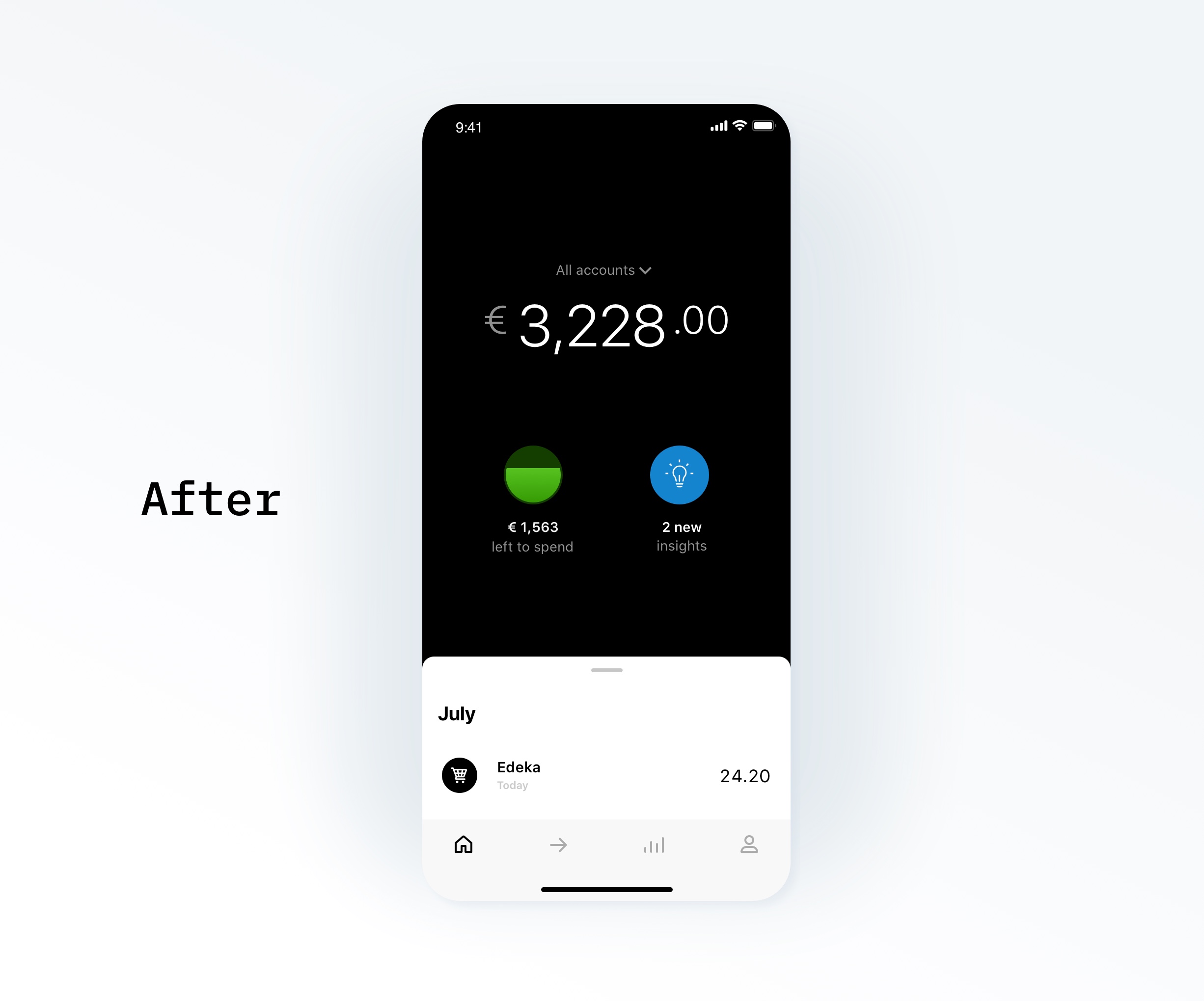
A new overview
The redesigned home screen brings the balance into focus and features two new elements: your left to spend and your insights. The latter gives you actionable items to improve your finances.
The transaction timeline is minimised to the bottom by default, showing only the latest transaction. The user can maximise the timeline by scrolling, swiping up or tapping on the bottom view’s handle.
For the design details, I worked together with the incredible Yago Sanz, whose UI magic was instrumental to the success of the project.
Spend less than you earn
My goal was to simplify budget management to an easy-to-develop habit: spend less than what you make. No need to label or sort spendings, set budgets for different categories, or read difficult charts.
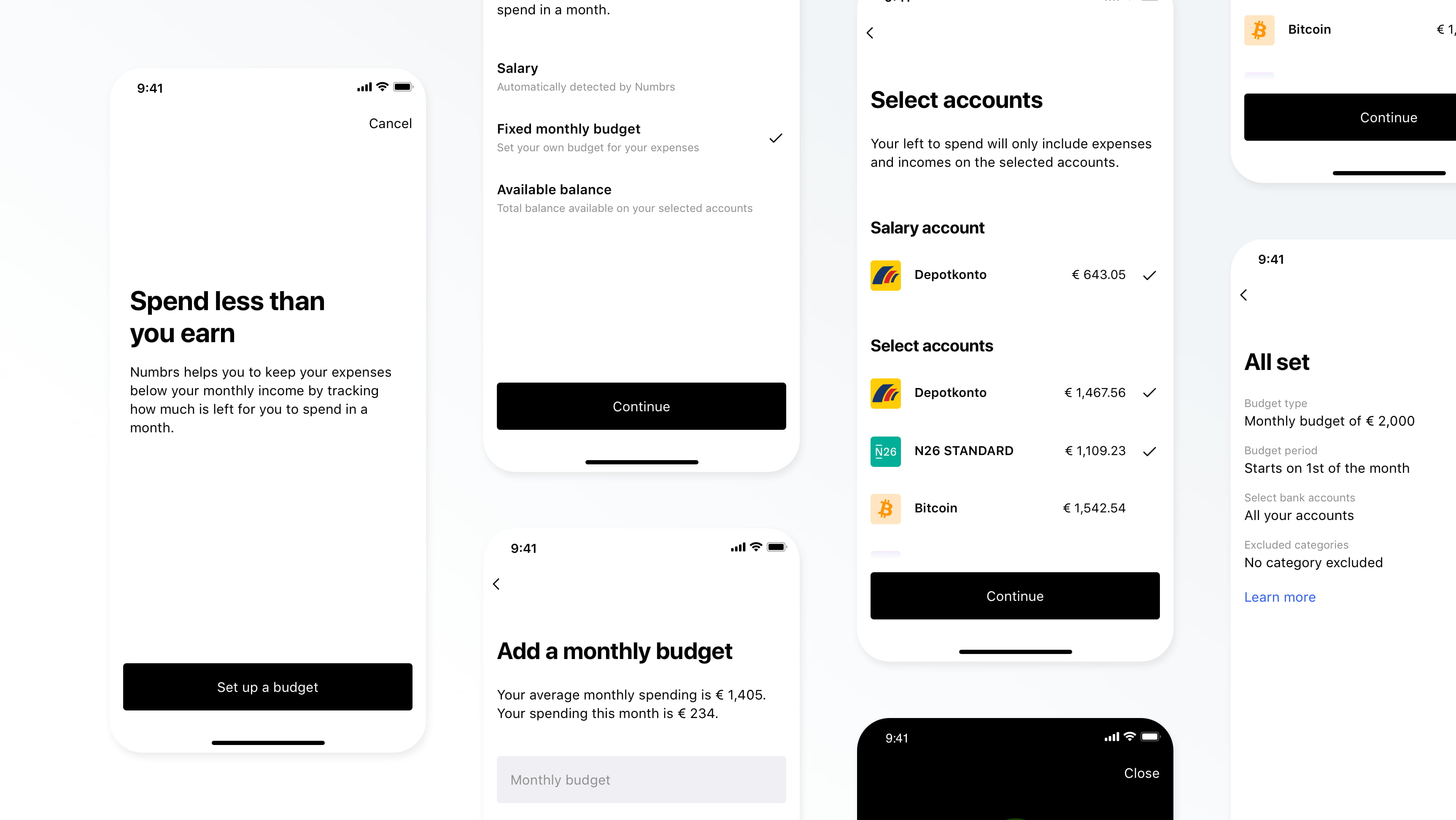
Your left to spend is a single amount showing how much money is safely available to you until your next salary—taking past, scheduled and also predicted payments into account.
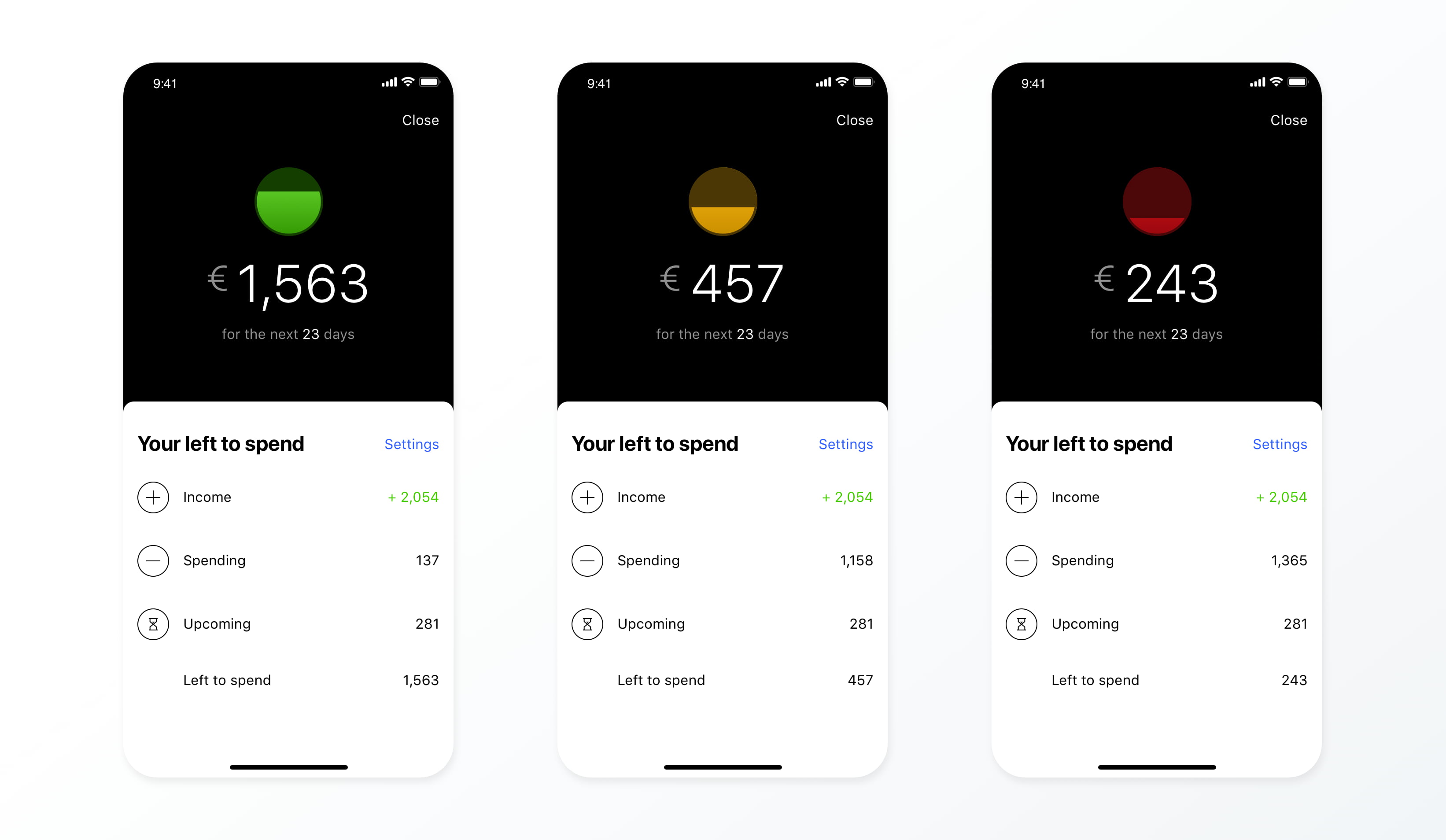
During the validation phase, the data science team helped me to establish that the feature will indeed work automatically for most users—those with regular income—, others can set their monthly budget manually. As for the visualisation, oh boy, I tried a good many versions and had heated discussions with the team. Good charts are always elusive.
My research at Numbrs have showed me how differently people think about their finances. Hence, I provided customization options—to cater for the known needs and to learn about the unknown ones.
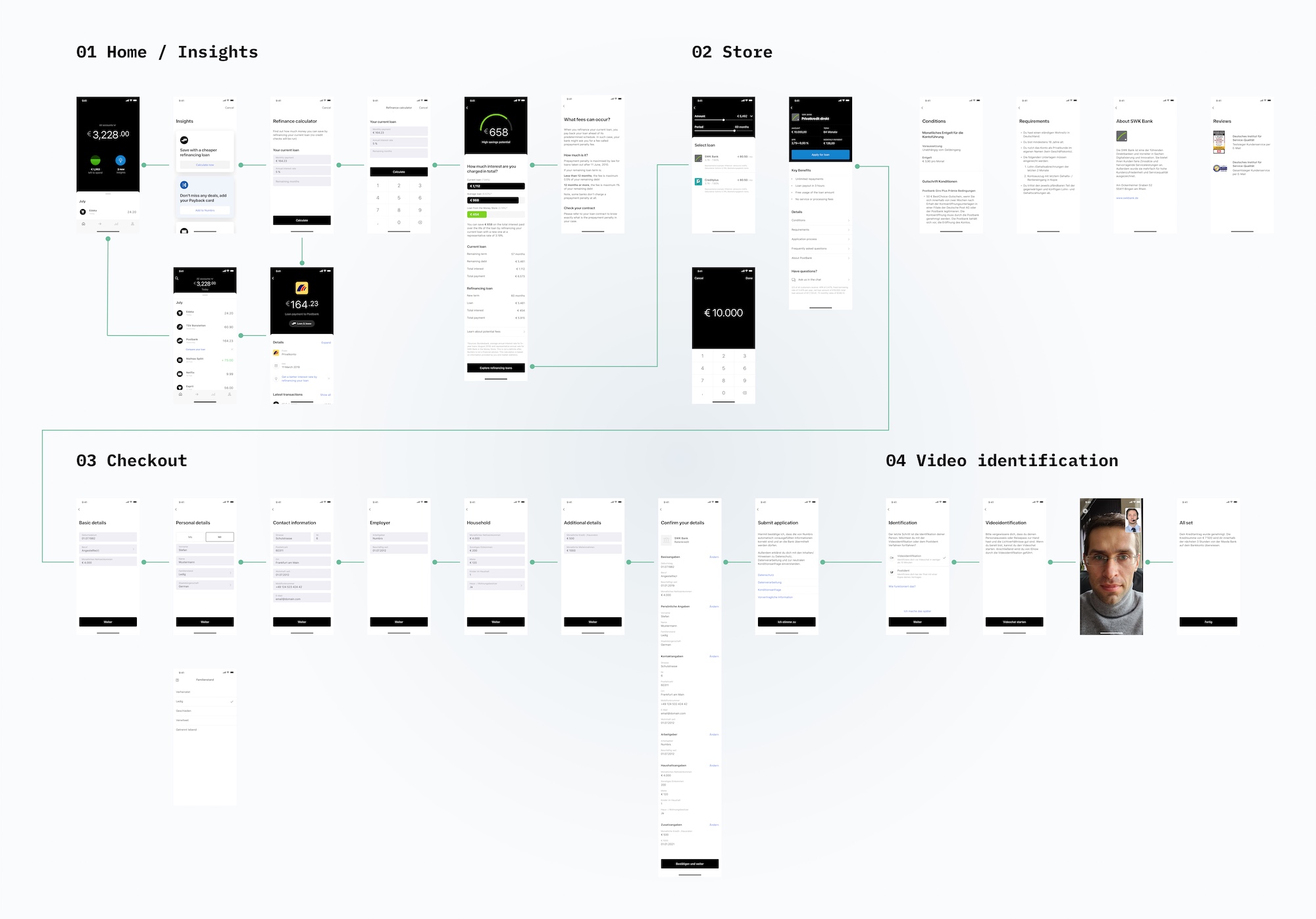
Insights
The insights feature gives you actionable recommendations to improve your financial health. It’s aimed to let you know about savings opportunities (eg. your subscription fees are higher than the average), changes in your habits (eg. you’re spending more on groceries than usual), unusual transactions (eg. Spotify billed you a higher than usual amount), etc.
Apart from providing AI-driven recommendations, this feature also paved the way for monetization.
For example, where we see a more expensive loan, we can provide a calculator and, eventually, cheaper refinancing loans.
To make the checkout flow as effortless as possible, we implemented a fully digital application process—including identification through a video chat—with project owner extraordinaire Florian Cannon.


© Zoltan Gocza